评论、TOC、顶部按钮样式适配
1.修改按钮背景CSS样式
hexo\themes\hexo-theme-matery-master\source\css\matery.css在matery.css文件中找到并修改四个样式:
.top-scroll .btn-floating {
    background: linear-gradient(to bottom right, #a8cbe2 0%, #05c6f1 100%);
    width: 35px;
    height: 35px;
}

.top-scroll .btn-floating i {
    line-height: 35px;
    position: absolute;
    right: 0px;
}
.comment-scroll .btn-floating {
    background: linear-gradient(to bottom right, #a8cbe2 0%, #05c6f1 100%);
    width: 35px;
    height: 35px;
}
.comment-scroll .btn-floating i {
    line-height: 35px;
    position: absolute;
    right: 0px;
}
2.修改图标CSS样式
hexo\themes\hexo-theme-matery-master\layout\_partial\back-comment.ejs
hexo\themes\hexo-theme-matery-master\layout\_partial\post-detail-toc.ejs
hexo\themes\hexo-theme-matery-master\layout\_partial\back-top.ejs
在以上三个文件中找到并修改:
back-comment.ejs:
<!-- 直达评论 -->
<div id="to_comment" class="comment-scroll">
    <a class="btn-floating btn-large waves-effect waves-light" href="#vcomments" title="直达评论">
        <i class="fas fa-comments" style="zoom: 0.88;"></i>
    </a>
</div>
post-detail-toc.ejs:
#floating-toc-btn .btn-floating {
    background: linear-gradient(to bottom right, #a8cbe2 0%, #05c6f1 100%);
    width: 35px;
    height: 35px;
}

#floating-toc-btn .btn-floating i {
    line-height: 35px;
    position: absolute;
    right: 0px;
}

<!-- TOC 悬浮按钮. -->
<% if (theme.toc.enable && theme.toc.showToggleBtn) { %>
<div id="floating-toc-btn" class="hide-on-med-and-down" >
    <a class="btn-floating btn-large waves-effect waves-light" title="展开/关闭TOC">
        <i class="fas fa-list-ul" style="zoom: 0.88;"></i>
    </a>
</div>
<% } %>
back-top.ejs:
<!-- 回到顶部按钮 -->
<div id="backTop" class="top-scroll">
<a class="btn-floating btn-large waves-effect waves-light" href="#!" title="返回顶部">
<i class="fas fa-arrow-up" style="zoom: 0.88;"></i>
</a>
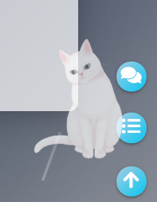
</div>3.效果